(Because at some point… the walls start looking back at you)
If you live in Lee’s Summit, MO, winter has a way of making you question every choice you’ve ever made… especially the paint ones. The trees go bare, the days get shorter, and suddenly that “nice neutral” you picked three years ago starts looking a little… suspicious.
And the funny part is, nothing actually changed.
You just had more time to notice it.
We hear it all the time. Homeowners in Lee’s Summit will say things like, “I never hated this color until now,” and we’re like… yep. That’s the season talking.
So instead of pretending paint trends don’t matter while secretly searching “best paint colors 2026” at 11:47 PM, let’s just talk about it. No design snob energy. No pressure. Just real paint color ideas that feel livable, cozy, and actually make sense for homes around here.
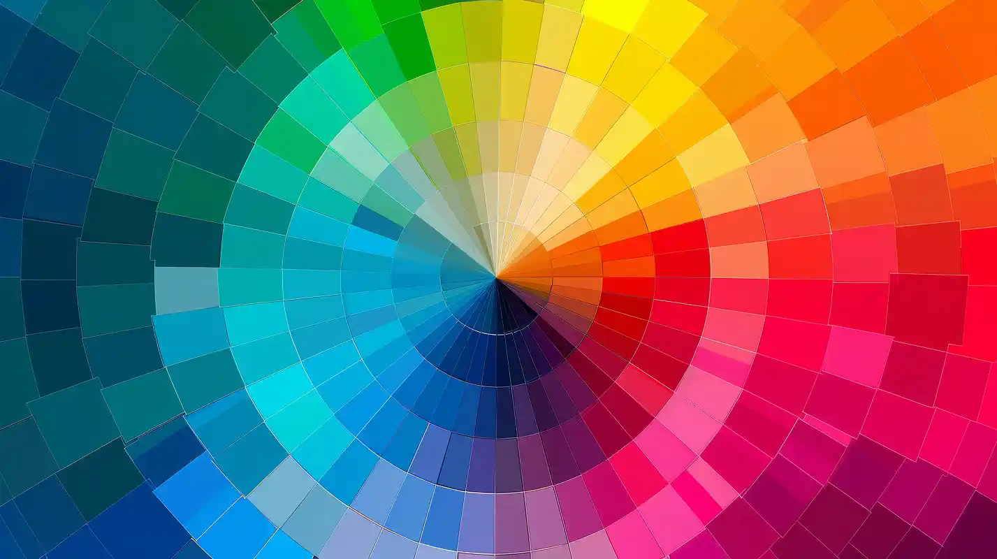
Why 2026 Paint Colors Feel Different This Year
This year’s trends aren’t about being loud or shocking. They’re about comfort.
Homeowners are leaning into colors that feel steady and calming, but still have some personality. Think “I want my home to feel fresh,” not “I want my dining room to feel like a nightclub.”
And honestly, in Lee’s Summit, where we get everything from humid summers to gloomy winter stretches, paint has to look good in real-life lighting. Not just in a showroom under fifteen fluorescent bulbs.
Interior painters in Lee’s Summit MO are already seeing people choose colors that feel warm, clean, relaxed, and forgiving. Because nobody wants to repaint again in six months.
Alright, let’s get into the trends that keep popping up.
-
Warm Neutrals That Don’t Feel Boring
Gray had a long moment. A very long moment.
In 2026, warm neutrals are sliding back into the spotlight. Think:
- soft beige
- creamy tan
- sandy tones
- gentle warm off-whites
These colors make rooms feel welcoming without looking yellow or dull. They also do a better job handling Missouri’s winter light, when everything outside looks like it’s been set to “low battery mode.”
Great for: living rooms, hallways, open layouts, and “I want it to look nice but I don’t want stress” spaces.
-
Muted Greens That Feel Calm, Not Loud
Green is still having its era, but the bright “jungle wall” look is cooling down.
Instead, people are going for soft, muted greens that feel peaceful and grounded, like a deep breath in paint form. They work beautifully with natural wood, black hardware, and neutral furniture.
Great for: home offices, bathrooms, laundry rooms, and bedrooms.
-
Soft Clay and Dusty Peach (Yes, It Works)
Before you picture a 1992 bathroom… relax.
These aren’t neon peach or salmon. They’re modern clay tones, warm and muted, and they look surprisingly classy in the right space.
They’re perfect if you want a home that feels cozy and “put together,” without being plain.
Great for: bedrooms, guest rooms, dining areas, and even a small accent wall.
-
Deep Blues That Feel Cozy, Not Cold
Moody blues are staying, but they’re softening just enough to feel more “livable” and less “I’m trying to be dramatic.”
Deep navy and smoky blue shades bring depth without making a room feel like a cave.
Great for: dining rooms, accent walls, mudrooms, and anywhere you want a little richness.
-
Terracotta, But the Softer Version
Terracotta is still trending, but now it’s more earthy and subtle, not loud orange.
This color family adds warmth fast, which is helpful when a room feels cold or flat.
Great for: kitchens, breakfast nooks, and spaces that need some life without yelling about it.
-
Mushroom and Greige (The “Just Works” Colors)
These colors don’t beg for attention, and that’s exactly why people love them.
Mushroom tones and soft greige shades adapt well to different lighting, which matters in homes that change mood depending on the time of day.
They also pair well with most floors and trim, which saves you from the “why does this color hate my house?” feeling.
Great for: whole-home interior color schemes and open spaces.
-
Rich Browns That Look Intentional
Brown is making a comeback… but not the heavy “early 2000s basement” brown.
Modern browns are warm, soft, and grounded. They create a comfortable, cozy vibe without feeling outdated.
Great for: bedrooms, dens, libraries, and cozy living spaces.
-
Dusty Lavender (Don’t Panic)
This one surprises people, but it’s real.
Dusty lavender isn’t loud or purple. It’s calm, subtle, and gives a room personality without making it feel childish.
It’s a “soft mood” color, not a statement color.
Great for: bedrooms, bathrooms, guest spaces, and nurseries.
-
Warm Charcoal Instead of Pure Black
Black walls still scare people (understandably). But warm charcoal gives you that dramatic contrast without being harsh.
It looks bold, clean, and modern, especially with warm lighting and neutral trim.
Great for: accent walls, powder rooms, office spaces, and modern entryways.
-
Creamy Whites That Don’t Feel Sterile
Bright white is stepping back a little, and warmer whites are taking over.
Creamy whites feel softer, warmer, and more “home,” especially in rooms that don’t get tons of natural light.
Also, they’re more forgiving when you’ve got kids, pets, or a dog who thinks the hallway wall is a shoulder-rest.
Great for: kitchens, living rooms, trim refreshes, and whole-home interiors.
-
Sage Gray That Changes With the Light
Sage gray is still popular because it adapts like a champ.
Morning sunlight? Looks fresh.
Overcast day? Looks cozy.
Warm lamps at night? Looks relaxed.
It’s one of those colors that doesn’t fight your furniture, flooring, or mood.
Great for: open layouts, living rooms, main areas, and hallways.
-
Misty Blues That Feel Clean and Peaceful
Soft blues are popping up again, but now they’re lighter and calmer.
Misty blue shades feel clean without being cold, and they work well in spaces where you want a relaxed vibe.
Great for: bathrooms, bedrooms, and guest rooms.
How These Colors Hold Up in Lee’s Summit Lighting
Paint behaves differently in real homes than it does on a tiny little swatch card you grabbed at the store in a hurry.
Between winter gray skies, afternoon sunlight, and the way lighting changes from room to room, the same color can look totally different depending on where it’s painted.
That’s why 2026 color trends are leaning toward shades that stay stable and comfortable in everyday life, not just in staged photos.
Common Paint Color Mistakes We Still See
Even smart homeowners do these (no judgment, we’ve all been there):
- picking a color under store lighting only
- skipping test patches and going straight to full commitment
- ignoring how the color looks at night
- forgetting sheen matters as much as color
A matte beige and a satin beige might as well be two different colors once they’re on the wall.
A Helpful Missouri Homeowner Resource
For general safety and building guidance for homeowners in Missouri, this is a solid place to start: https://www.missouribuildings.org/
Final Thought (The Calm One)
Trends come and go, but the best paint color is the one that feels right every time you walk into the room.
Even if you don’t repaint this year, knowing what’s coming in 2026 can help you plan, save ideas, and avoid picking something that feels dated fast.
And if you ever want a second opinion, help testing colors, or someone to confirm “yes, that one actually works,” the team at J&T Painting in Lee’s Summit, MO helps homeowners sort through these decisions every day.
No pressure. No rush. Just solid guidance when you’re ready.